With consumers yearning for tactile shopping experiences and a relaxing of the rules around leasing due to a massive surplus of empty retail spaces, pop-up shops are becoming increasingly popular. Print graphics are essential to create an impactful and immersive experience so we’ve created the following guide to help inform and inspire your own plans for pop-up shop graphics.
The benefits of pop-up shops for brands
In an increasingly digital world, in which brand loyalty has been displaced by rapid convenience, consumers are once again hungering for meaningful connections with the business they buy from. Pop-ups that create memorable experiences or the ability to access limited edition products help build customer loyalty.
Pop-up shops ‘pop up’ for a variety of reasons, not all of them related to direct sales, although with the pop-up industry now worth an estimated £2.1 billion, (the equivalent to 0.6% of the whole retail turnover in the UK) the financial opportunities are clear. Yet there are other benefits to be gleaned from hosting a pop-up of your own:
Test out new ideas
One of the positives of a pop up shop is their inherent temporary nature. They allow brands to experiment with ideas, and interesting and unique pop up shop graphics and can be useful tools when attempting to expand your brand, as they allow you to trial new products, a new location or customer base, or even attempt face to face sales for the first time by creating a tangible space for online-only brands, all while being cheaper and lower risk than a permanent brick and mortar store.
Makes use of time-specific factors
Pop-up shops are also used to take advantage of timely and temporary contexts, such as periods of larger footfall (a cocktail based promotion at the height of summer, for example), to showcase time-specific or limited edition products or promotions, or to spotlight a collaboration with another brand (the coming together of two different brands have created some of the most inventive and memorable pop up shops of the last decade.)
Considerations for your pop up shop graphics
Know your customer base
When planning graphics for your pop up business, it can help to really think about who your target customers are, and if they differ from -or are more niche than- your usual clientele. Match this up to your current branding as well as the stylistic particulars for the product or service that you will be selling.
You want it to be a celebration of all that your brand stands for, mixed in with something new and memorable. Your design choices should clearly reflect your branding to at least some extent, but it can also help to weave in elements that are unique and stand out from your usual media styling.
Don’t overthink it. When in doubt, remember to stick to what your company stands for visually, as opposed to hopping on the latest trend or bandwagon; what may work for a pop-up for one business may not be as well received by the customer base of another.
Think about your location
This can also be true when you think about where your pop-up will be based, the location of the shop can help inform your decision making as much as your own brand itself.
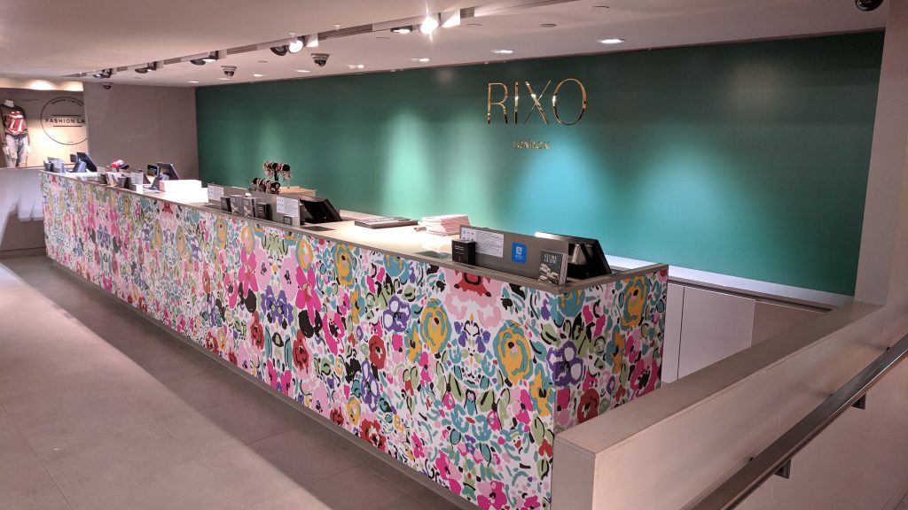
For example, when PressOn created pop up shop graphics for RIXO for their stage at London Fashion Week, even with their outstanding aesthetic the design choices had to complement and work with their surroundings, while also taking into account the people who would be attending the event. Rather than hide the ornate decor at the Kimpton Fitzroy Hotel, they incorporated it into their existing baroque look.
How to use graphics to make the most out of your pop up shop
Use graphics to create immersion
Whatever the purpose of your pop up shop is, you want it to be a memorable event, and the best way to do that is to go all-in with the design, using printed graphics to make it a thoroughly immersive experience.
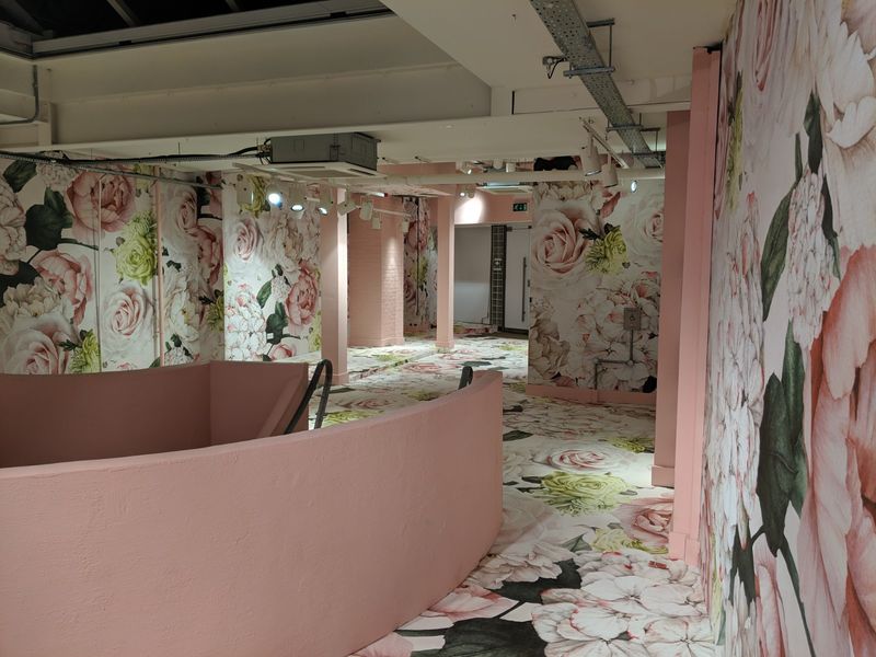
A great example of this is when we created pop up graphics with Harrods for their Fashion Re-told 2019 pop-up boutique.The floor-to-ceiling prints helped make the pop up truly memorable and feel like a real ‘event’; befitting the fundraising purpose of the space.
Utilise every surface
To create this level of immersion, every surface and every space needs to be thought out; even blank space should be accounted for if it is left empty – make it purposeful. The separate graphic elements need to work together, to create a harmonious overall effect. Here at PressOn, we can help you with both the design and production of your print graphics and ensure there is 100% colour consistency between your graphics: something that can be particularly troublesome to get right if you’re using a variety of substrates and surfaces.
Floor graphics can be one of the most effective ways of creating a truly 3-dimensional environment, expanding the printable area from walls and other vertical surfaces. These types of graphics can also be designed to separate a space into zones, direct consumers to the tills or point of purchase, indicate where to queue, or simply create a visual distinction between the exterior space and the floor in your pop-up. All of these can be enough to tempt consumers over the threshold.
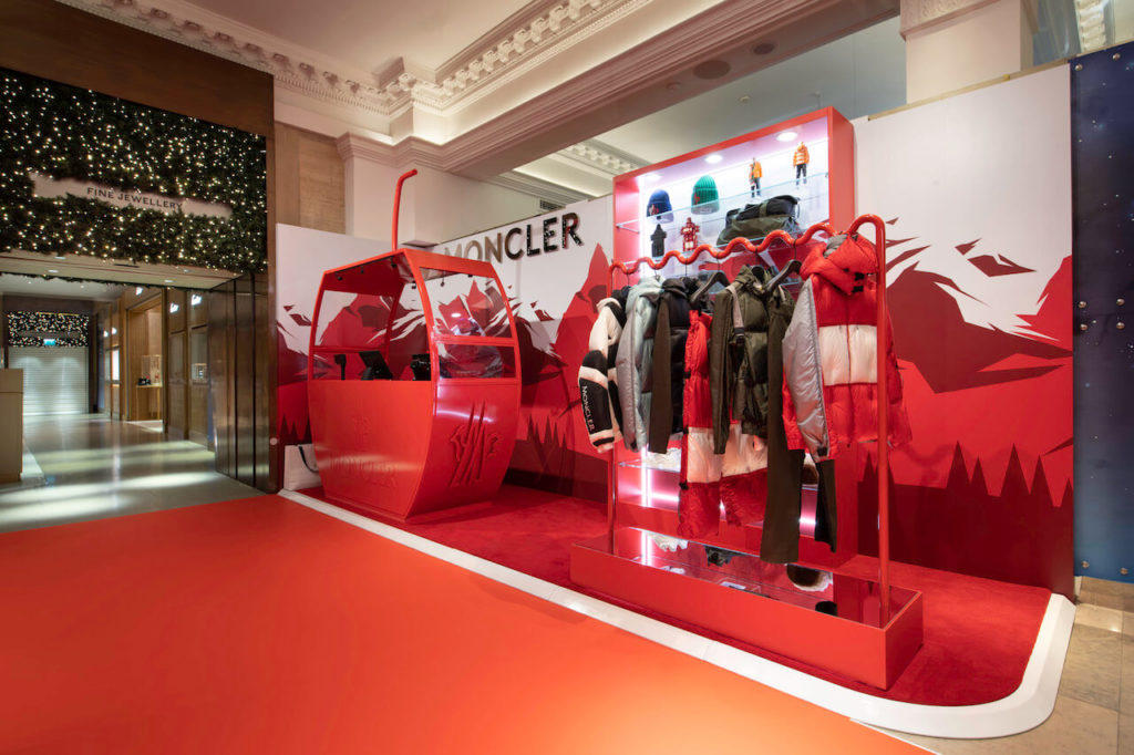
Beautiful pop up shop graphics can create something to make your event both memorable and shareable on social media, such as the Moncler pop up that we created graphics for. The uniquely visual way that the clothes were displayed worked symbiotically with the on-brand red-based graphics to create a fully immersive experience, one that passersby felt they had to walk over to see.
Guide people through the space
There’s no way around the fact that most pop-up shops are small. If successful, they can get very crowded, very quickly, and you will need to do as much as you can to prepare for that both in how you lay it out and plans for how to deal with it at the time.
As well as large one-piece wall coverings, print graphics can work well as a wayfinding and directional tool. If you are limited on wall space, you can also consider incorporating floor graphics to guide customers through the pop-up, either as a full floor surface covering or as cut out vinyl graphics, that mark the route you would like the customer to take, or to point out the entrance, exits or till area.
The power of POS
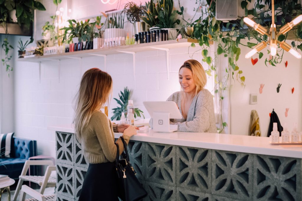
The Point of Sale (POS) area is also the perfect place to cement your branding message, leave a lasting impression and sometimes even make a last-second sale. In smaller spaces the POS area is usually the focus of the room, not least because your staff will usually be standing there.
The graphics you place at POS will likely have a captive audience, at least for the time it takes to be served. Make use of this by educating or inspiring your customers with infographics about your business, current or forthcoming promotions, or images and text that reinforces your brand messaging.
Use Graphics to make it feel like an event
By their very nature, pop-up shops are an ‘event’, and you can use graphics to really hammer this home aesthetically. Nothing says “exclusive event” quite like an eye-catching entrance, with window graphics or other unique printed media.
It can also serve as a way of getting the attention of passers-by, especially if your pop up is located in another shop or has a smaller storefront: you may be in a single unit with a large window front, in which case you can use impactful design and graphics to create something diverting enough to draw people in off the street.
Incorporate interactive graphics
Something that more brands are now including is an area specifically for photographs or something to share in a social media post, thus improving brand reach. Photo backgrounds or backdrops work well, and can be as simple as a large one-piece-wall graphic to lure people into taking a selfie for Instagram.
Think outside the (pop-up) box
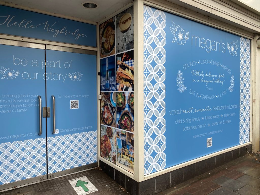
In our interconnected work, it’s hard to hold an event without some sort of leak online, so why not use the anticipation and mystery to your advantage in the form of pre-launch and reveal graphics, such as those we helped create for Megan’s restaurants?
These kind of graphics can work particularly well in conjunction with online campaigns and QR codes, to connect your physical installation with a digital campaign on social media or your website. Brands can also opt for creative hoarding graphics around the site if a construction barrier is in place.
Final thoughts
Pop-up shops serve many purposes and can be a fantastic way to get your company some positive exposure. The scope for advertising and designing your pop-up shop with print graphics is truly endless. Here at PressOn, we can help you create the perfect print media solution for your pop-up shop.
Whichever types of print or graphics you opt for, you can be sure that the final product will be perfectly geared to your particular needs, durable enough for the time frame, and with our signature quick turnaround and installation – allowing you to make a lasting impression on your customers.
